Challenge
The website is a simple WIX page mirroring a word document and misses the key elements you’d expect to see on a website. All work through Grady Cares is done by its charity lead with the support of volunteers and other local non profit organizations. How can the site be improved so that more users volunteer, donate, and continue supporting the organization?
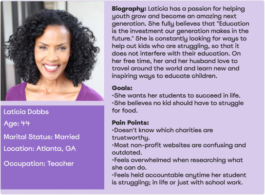
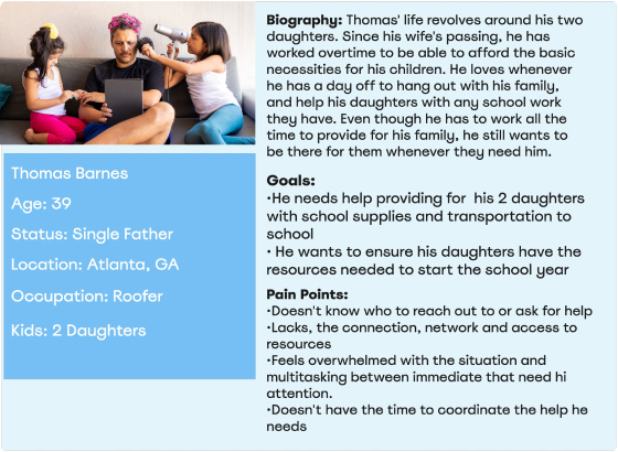
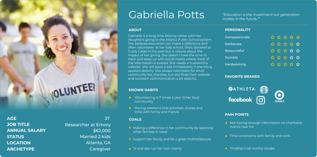
Proto Personas
I took the approach of using 2 proto personas since the organization spans 2 user types:
1- Users who want to help
2. Users who require help
User Research
Interview & Survey Information:
- Conducted 5 User Interviews
- Surveyed 16 Individuals
- Met and interviewed the charity’s founder for information on goals/struggles
Goal- How can we make Grady Cares website more user friendly?
- Objective 1- Identify the sites purpose
- Objective 2- Identify what causes users to trust a non-profit website
- Objective 3- Discover what causes users to return to a website

User Data Analysis
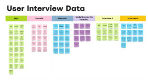
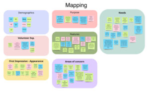
What do users want to see in order to gain confidence and return?
- Information on how to volunteer/ donate
- List of items needed
- The non-profit’s accomplishments in the community
- Program leaders and contacts
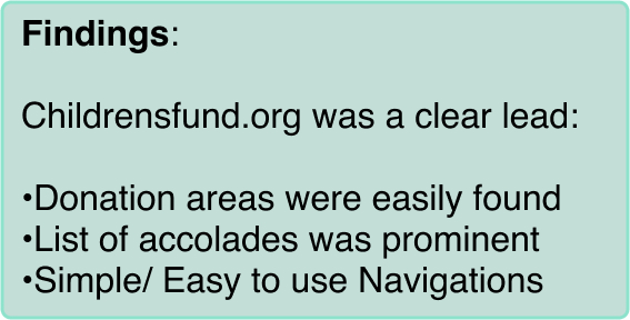
Competitor Analysis
We reviewed 2 direct and 2 indirect competitors to further understand how we could improve from the current state:
Direct:
Childrensfund.org
Classroomcentral.org
Indirect:
Goodwill.org
Kidneyfund.org
User Persona
Ideation & BrainStorming
The team took a further review on user data to better define what users would want to see on the updated site.
- Feature Brainstorming
- Prioritization Matrix
- User Journey
This process continued so that we could define the users journey and create a Storyboard.
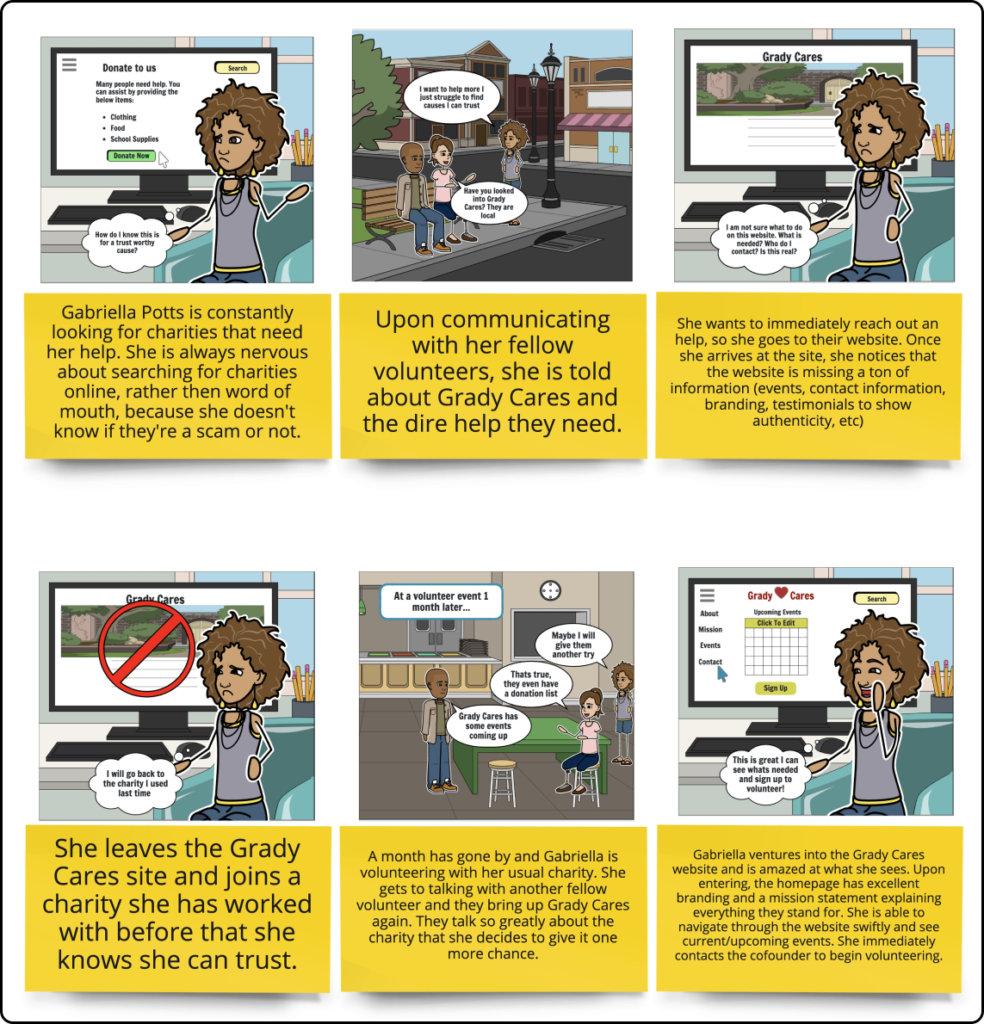
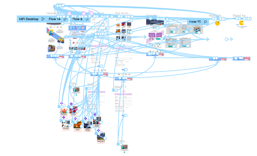
After defining the Users Journey and creating a Storyboard we moved on to Cardsorting and updating a new Site Map. From here we were able to create the Users Flow for the website.
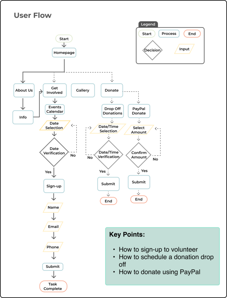
Prototyping
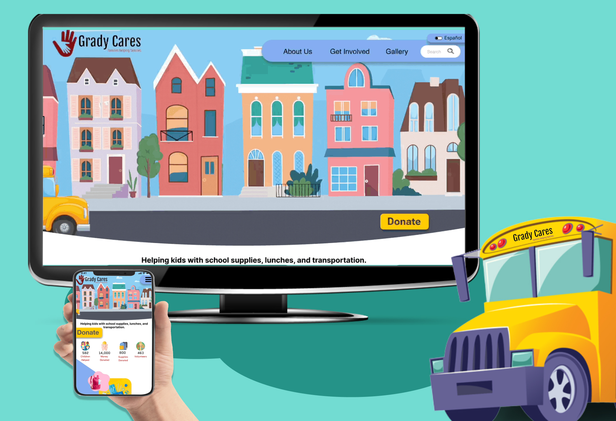
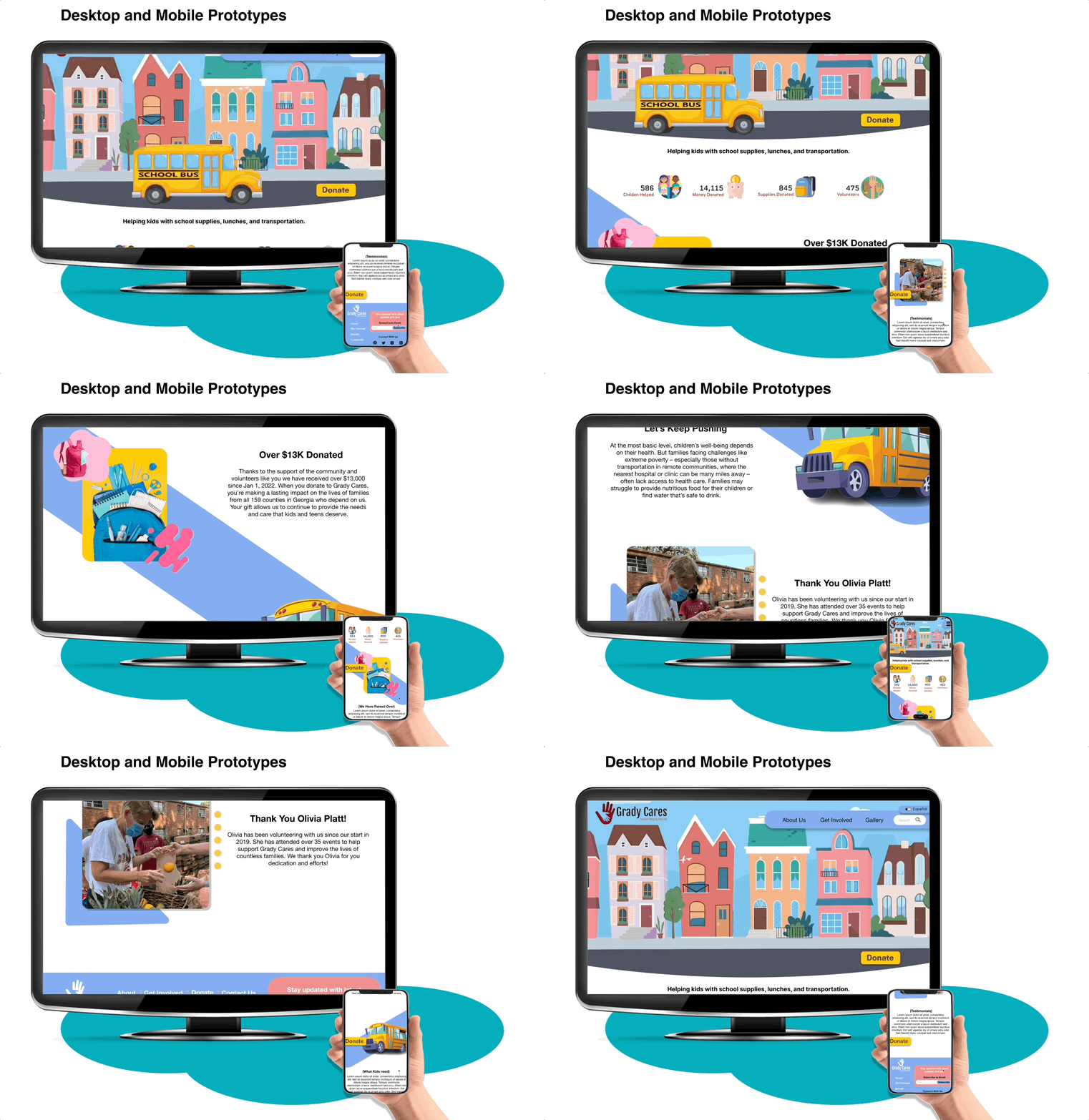
The team wanted to get inspiration for a new website design and focused on a 90’s style theme of school elements and fun playful colors. From here we designed LoFi and MidFi clickable prototypes in Figma for user testing.

User Task Testing
We asked users to complete 3 tasks:
- Sign up as a volunteer
- Make a donation
- Schedule a donation drop off
Previous user test showed us a main point of confusion was volunteer sign up and placement of the volunteer form. So we addressed this in our HiFi Prototype.

Re-Design Highlights & Iterations
Based on user feedback we wanted to ensure the site had the following items:
- Fun, colorful, and interactive aesthetic
- Easy sign up for volunteers
- An easy call out to donate
- A way to schedule a donation drop off for users so that Grady Cares can plan in advance
Next Steps
Given the current time constraints we recognized several ideas that we think could further develop the website.


